
Free Customer Journey Mapping Guide
Learn how to attract new customers with ease, without pushing and hustling and retain more of your existing customers, who become your loyal advocates!
This client came to us for the full branding experience of her new Indonesian meal kits. We helped build her brand from scratch, even helping with the name. She wanted her branding to be both traditional and modern to appeal to the Western buyer.
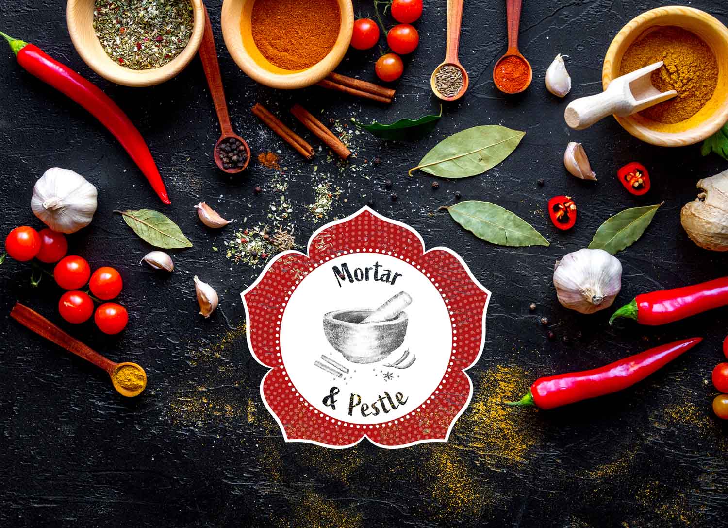
To begin the branding process we did extensive research on Indonesian culture with Chinese influence, known as Peranakan culture. Bright, bold colours and patterns are the face of the culture, often including florals and patterned tiles.
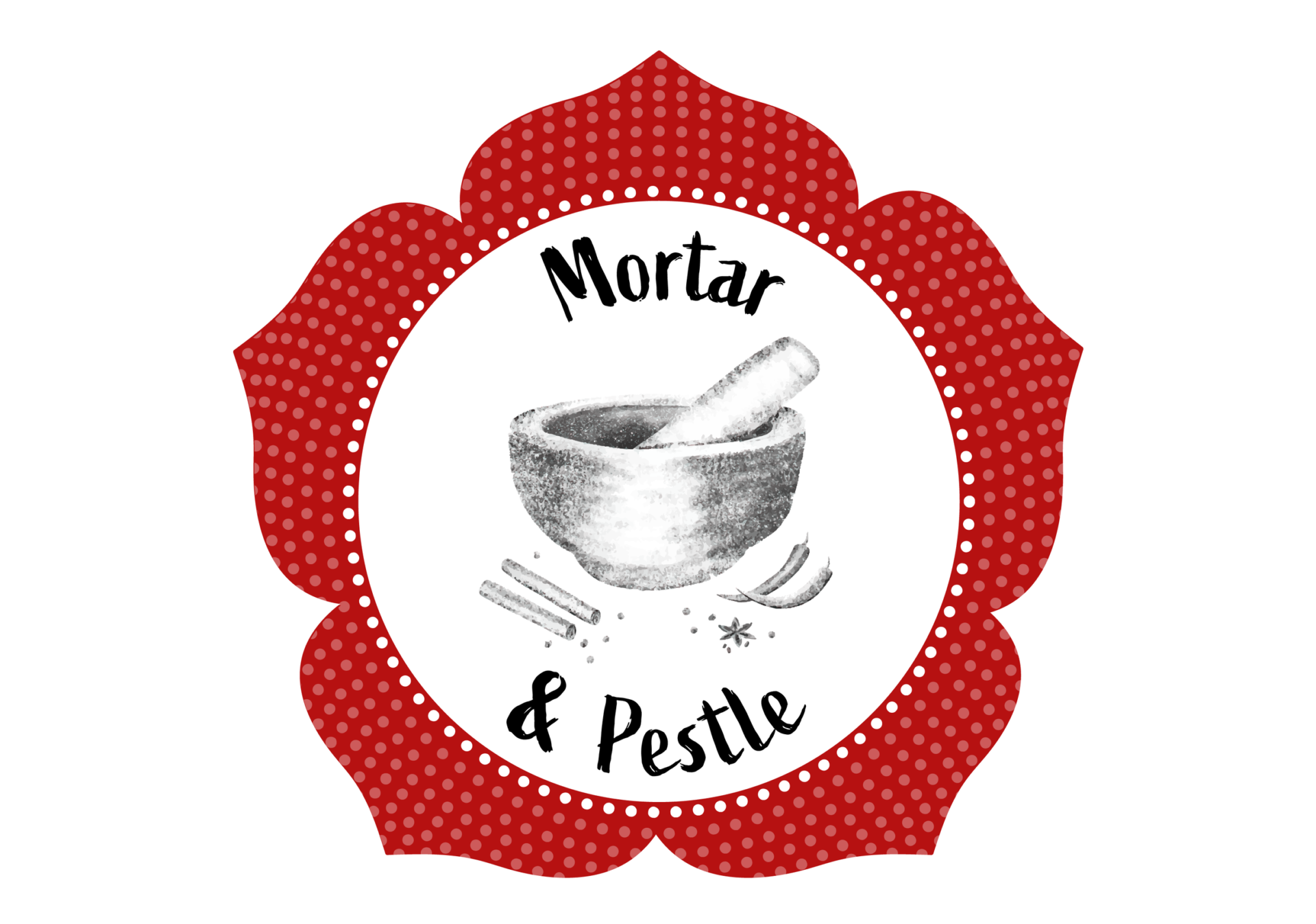
The name Mortar & Pestle came from the traditional way Indonesian spices are made, of course being ground in a mortar and pestle, along with the idea of making these spices and the specific ingredients in them a feature of the product.
Mortar & Pestle’s logo combines the name of the brand with Peranakan elements. The sketched mortar and pestle with spices adds an old-school, traditional feel, whilst emphasising the brand’s values.
The red patterned flower brings in the Peranakan influence, whilst the handwritten style font adds a modern element to balance it out.
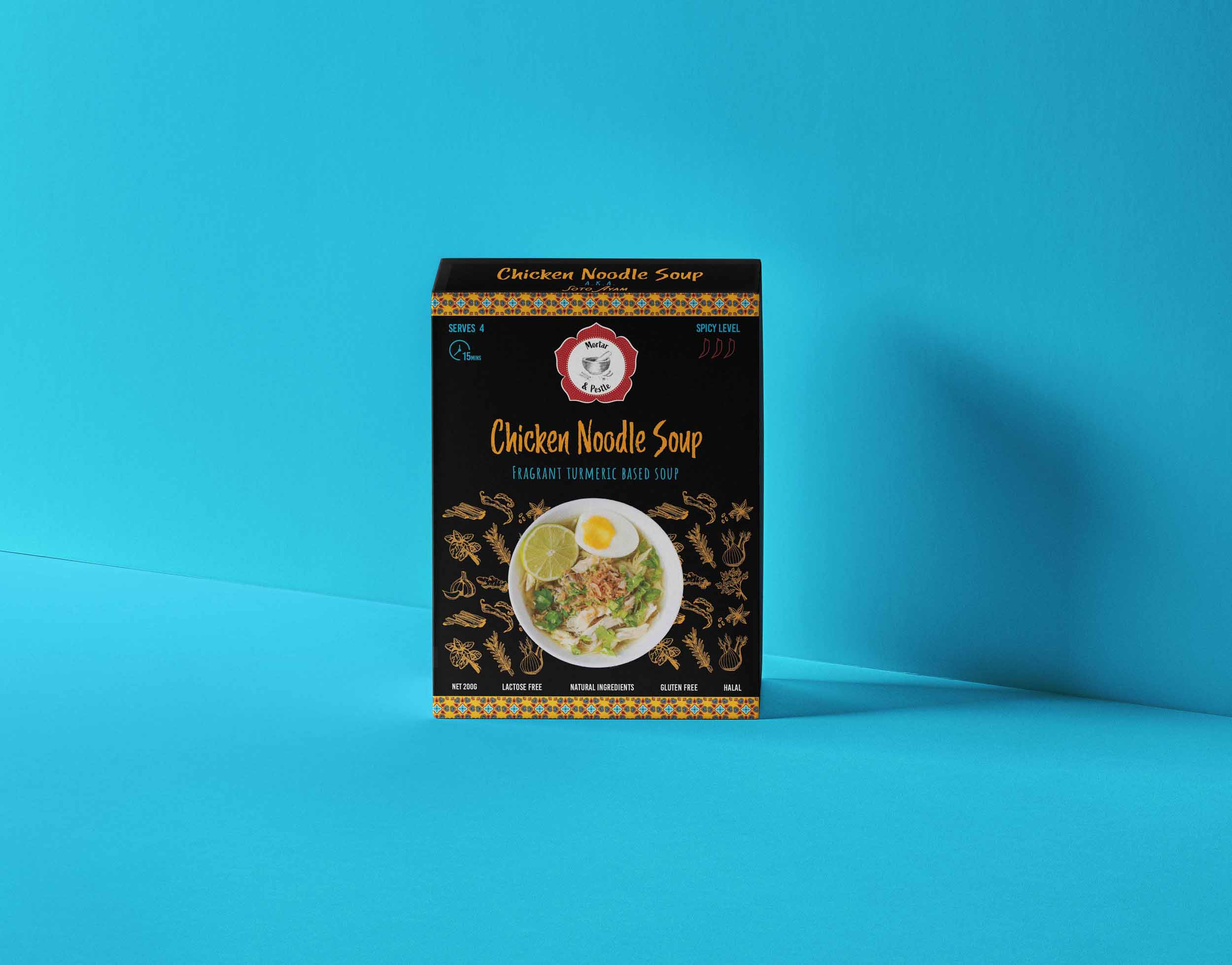
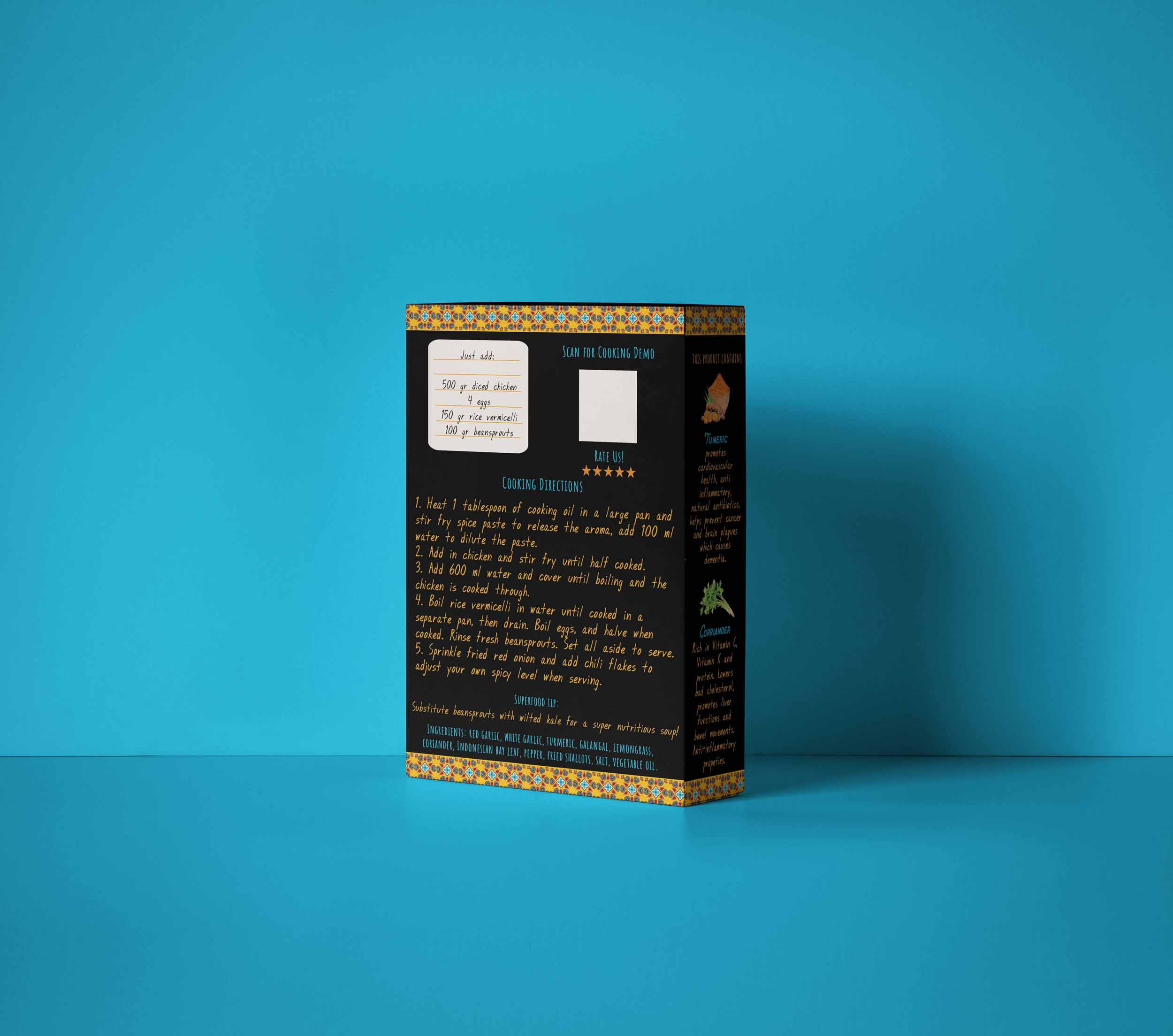
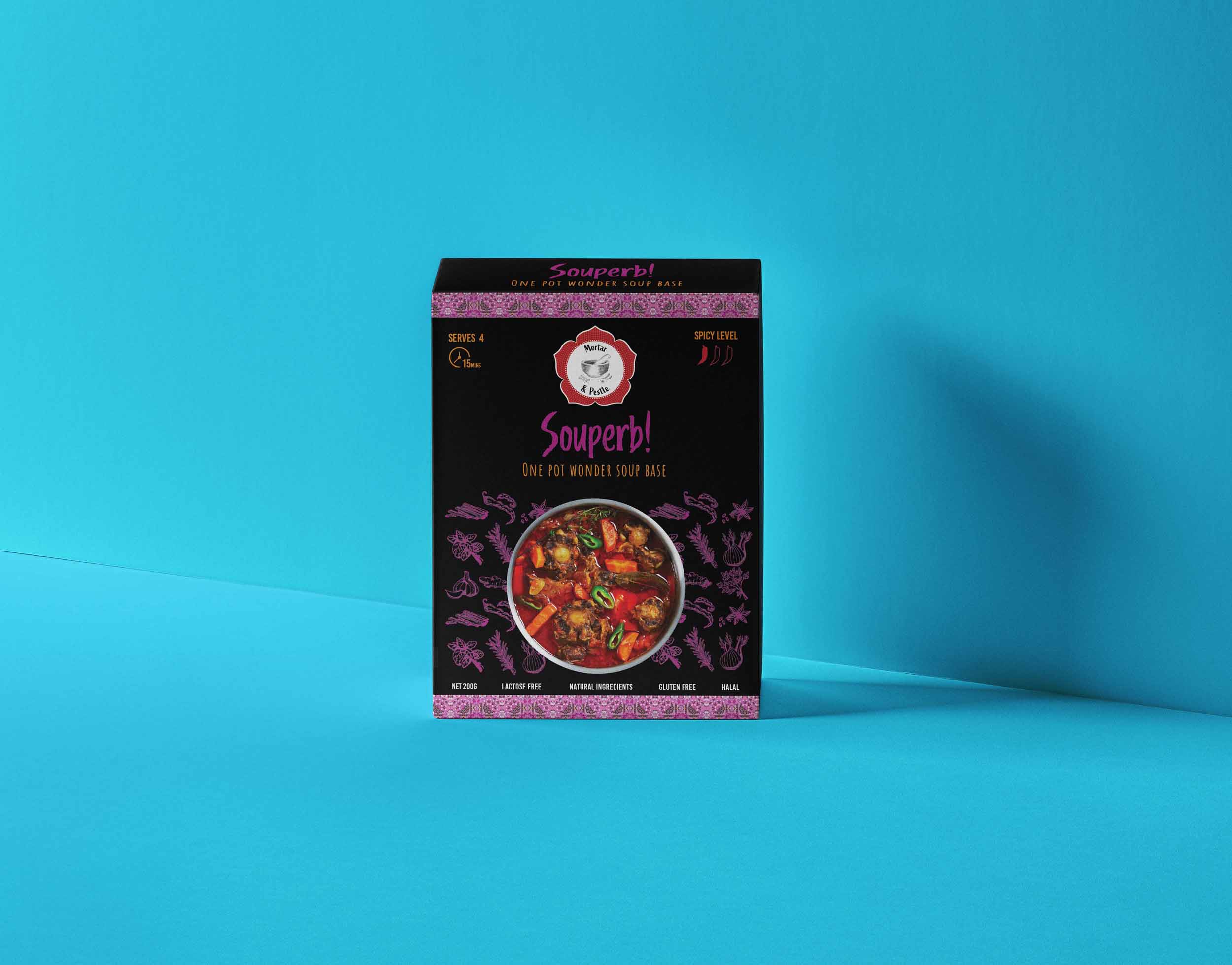
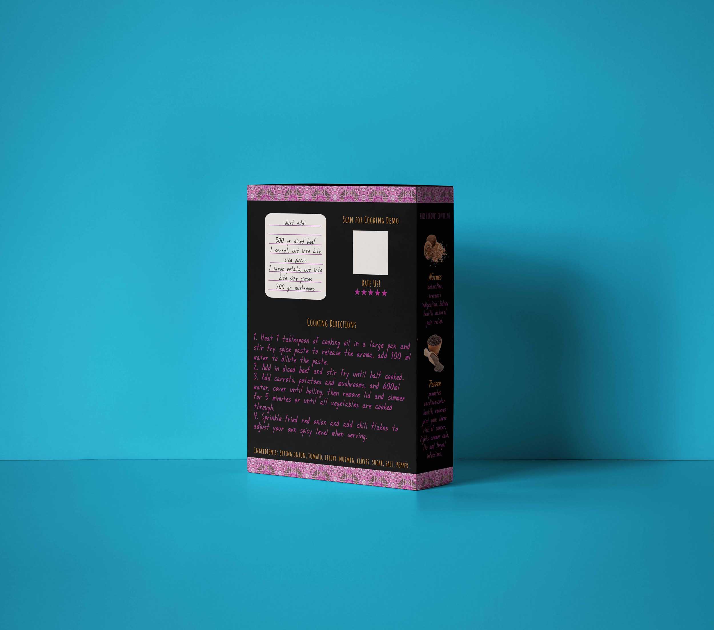
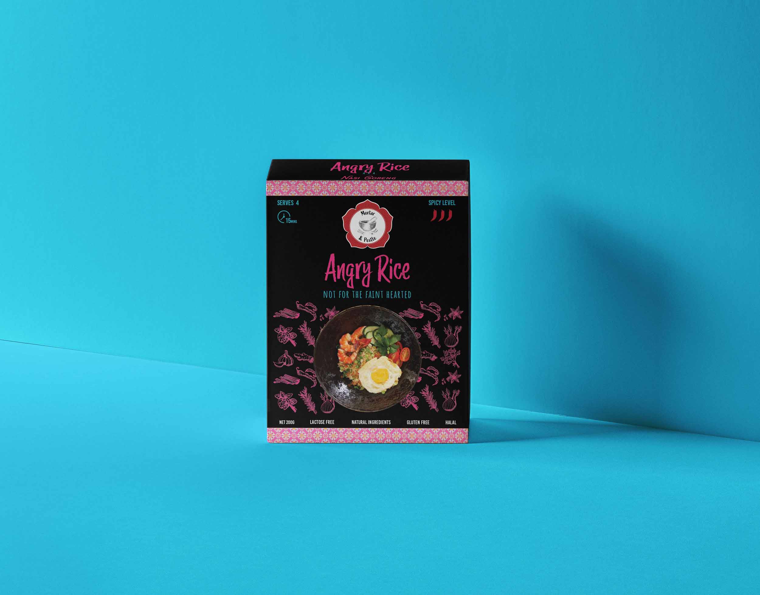
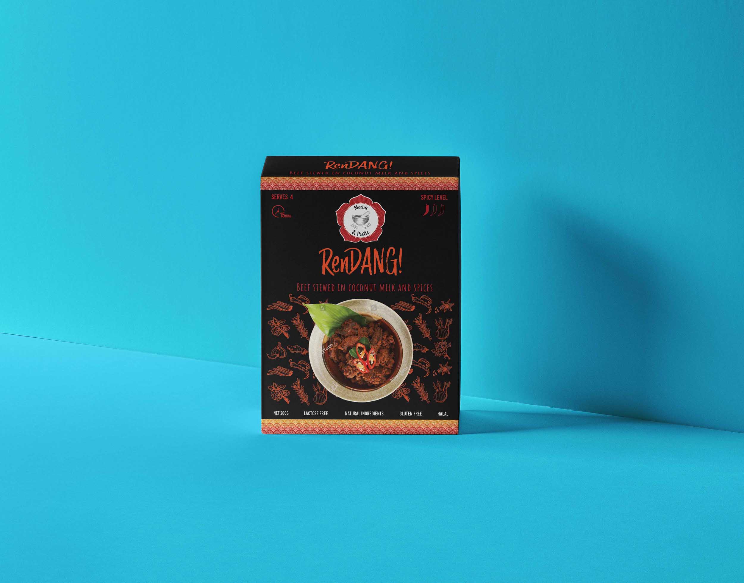
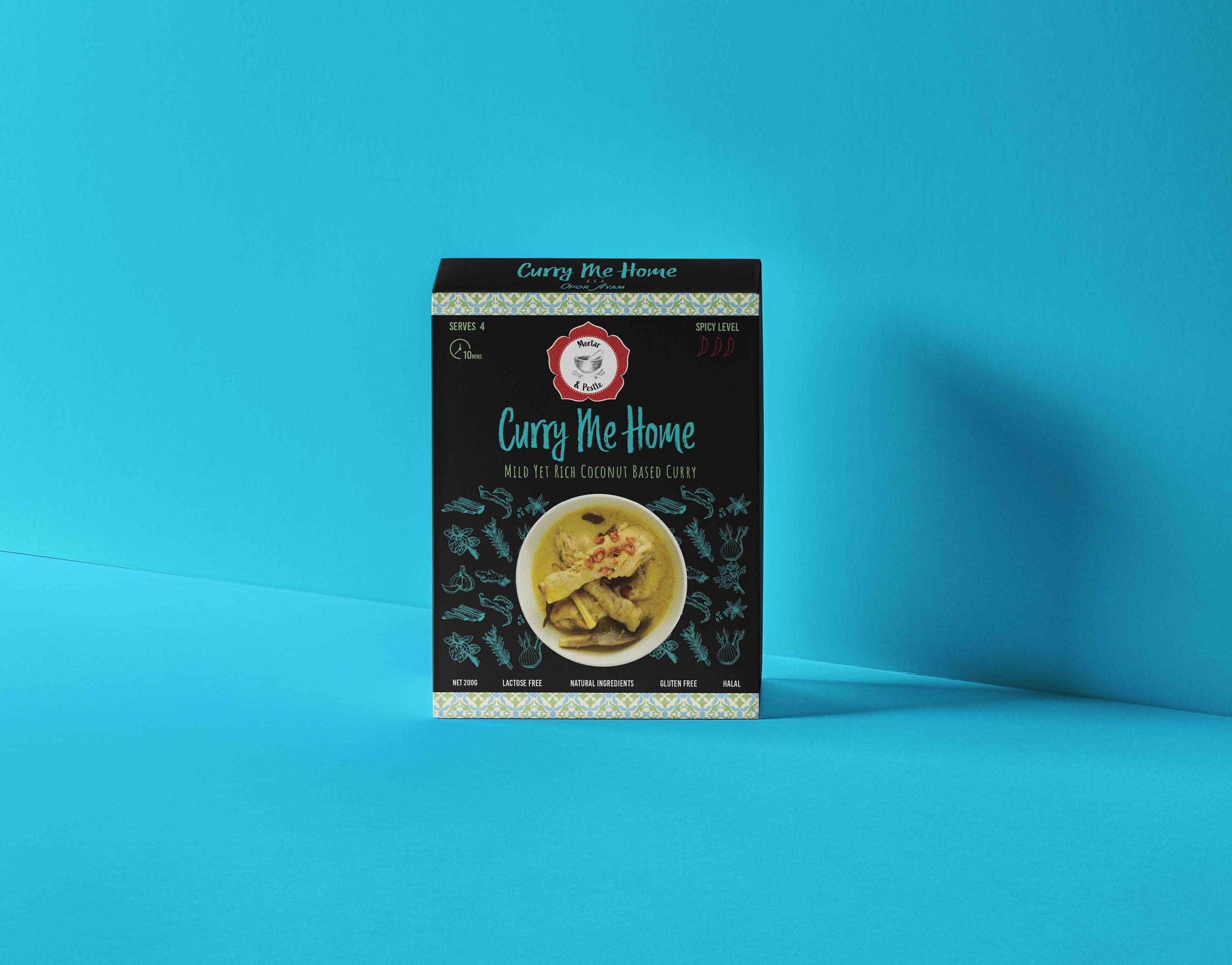
When it came to packaging, we focused on three things: bright Peranakan patterns, spices, and puns.
To really bring in the Peranakan elements, we decided to choose different patterns influenced by Peranakan tiles. Each box has a different pattern and two different main colours. The black background is a neutral colour so it will go with every colour combination, and also allows the bright colours to really stand out.
As our client wanted the spices to be a focus of the meal kit, we chose two of the main spices of each box to feature on the side. An image along with a short description informs the customer of the spices health and other benefits.
Finally, we decided to add some humour to each box by making up a pun with the name of each dish. This was a fun way to give each one a name that Western consumers would understand.
Download this tool so you know how and when your customer becomes aware of your brand and beyond!
P99 acknowledges and pays respect to the Whadjuk Noongar People, the Traditional Owners of the land we live and work on.

Sign up to get our monthly newsletter!
It includes behind-the-scenes content, helpful tips, and business funnies.
We won’t bombard you with a 1001 sales/ follow up emails. Instead, you’ll get heaps of golden nuggets with no strings attached!
Learn how to attract new customers with ease, without pushing and hustling and retain more of your existing customers, who become your loyal advocates!